Dashboards & data
Numbers your customers can actually see move
Most businesses are sitting on the answer to a question they keep guessing at. Which jobs actually make money. Which customers come back. What happens to the year if prices move five percent. The data is already there, in the invoices and the bookings — it is just not in a shape anyone can look at.
You probably recognise at least one of these
- You have a hunch about what is profitable, but no way to check it
- Explaining your value to a customer takes longer than doing the work
- Your reporting is a spreadsheet somebody rebuilds by hand each month
- You want to test a change before betting the year on it
What you actually get
- A dashboard that answers one real question, not forty charts nobody opens
- Live models where you move an input and watch the result change
- Something you can turn round and show a customer mid-conversation
- Honest numbers, including the ranges — a model that hides its uncertainty is a sales pitch
- It runs on your own data, and it stays yours
No mystery, no big bang
Name the question
One decision you keep making blind. Not "a dashboard" — a question.
Find the data
Usually already in your invoices, bookings or exports. Rarely does anything new need collecting.
Build it so it can be shown
Made to be turned round on a desk, because the value is often in the explaining.
Keep it honest
Where the numbers are uncertain, it says so. That is what makes the confident parts believable.
Work like this we have already done
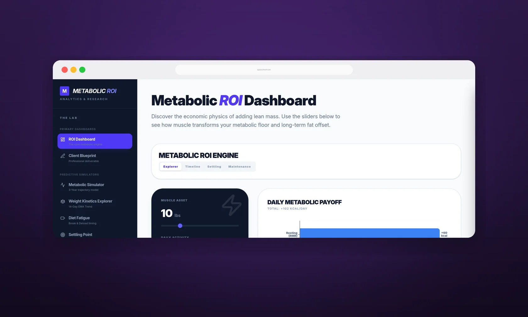
Metabolic ROI Dashboard
Interactive dashboards a trainer can explain the science with
Telling a client that muscle raises their metabolism does not land. Moving a slider and watching the daily numbers change in front of them does. A set of live dashboards and calculators built for explaining weight and body composition out loud, in a session.
Read the whole story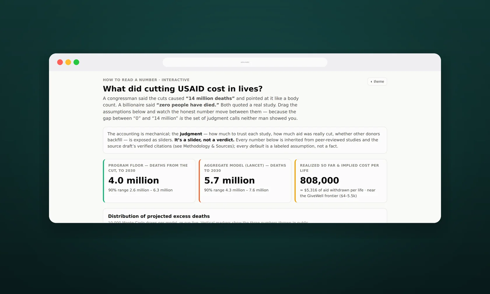
Policy Simulation Model
Showing where the experts disagree, instead of hiding it
Two respected sources published wildly different numbers for the same question, and the usual fix is to quietly average them. This lets you move the disputed assumptions yourself and watch both answers move.
Read the whole storyThe questions people actually ask
My data is a mess. Is that a problem?
It is the normal starting point. Most of the work is getting it into a usable shape, and that is included rather than something you have to sort out first.
Is this just charts?
No. The useful version lets you move the assumptions and watch the answer change — which is what makes it persuasive to a customer instead of only informative to you.
Do you do research work too?
We build our own research tooling — ResearchLens pulls apart contested studies and works out whether they genuinely disagree. It is internal, but it is why we are careful about how numbers get presented.
Tell us what’s driving you crazy
Twenty minutes on the phone, no charge and no pressure. We will tell you honestly whether this is worth fixing, roughly what it would take, or that you are fine as you are.